
Denotations - This is an advert for a clothing company
- There is a celebrity in the photo.
- 50 Cent looks very serious.
Connotations - The colour scheme consists of three colours: black, white and grey. These colours portray an atmosphere of seriousness and realism. The words ' I am what i am' as well as 'where I am from...' have both purposely been written/typed in white to suggest that these are both harsh but true realities of the world that we live in.
-The Font of the writing is written in a serif font which also connotes a sense of superiority and criminality as well as the vague finger prints that can be seen in the backgrounds. This could signify a sense of danger and power to a younger target audience that they would now associate with the brand rebox and as a result of this take a strong attraction to these shoes.
However, in opposition to this, the audience could get the impression that you are what you wear. So in correlation with this, if you wear Rebok, you would increase your element of criminality and rebellious attitudes. Or alternatively, the message given off here could indicate that criminality is the route to money and clothes, but with these mesmeric shoes on, the harsh criminal way of obtaining clothes isn't.
Lighting - The picture of 50 cent has quite dark and serious lighting. The dark background behind 50 cent signifies to an audience that he is possibly the light within a dark environment as the colours white and black have connotations of good and evil to a regular audience.
Subject matter - In this advert poster its clearly evident to an audience that the subject matter of this advertisement is to promote the company Rebook, whilst trying to create an element of criminality through using a public icon such as 50 cent.
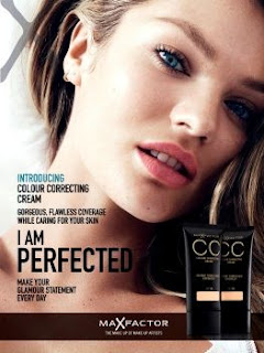
Connotation - This is an advertisement for makeup that predominantly young adults aged 15-25 would take a strong interest into. The words 'I am perfected' suggest to a younger female audience that makeup such as 'MaxFactor' have the tools to potentially recreate your image and create their own beauty similar to the one in the poster. This is not the case in reality, however the angle and lighting of the photo emphasise the beauty of the girl in the image. For example the lighting in the photo appears to be coming from the left hand side of the photo . This emphasises the clarity of her skin and is a camera trick purposely used to make her appearance more attractive and beautiful to a younger female audience which is enough to influence them to want this image for themselves.
Target audience - The target audience is actually meant to be aimed at older females aged 16- 30 , however the strong correlation that younger females have between the beauty with the amount of makeup used has always been the main reason for young female attraction to these expensive make up brands.